
2 September 2022
Katie Ponder has created 3 portraits for English Heritage.
Read article
9 December 2021
Posted in: Branding, Design, Illustration, Packaging

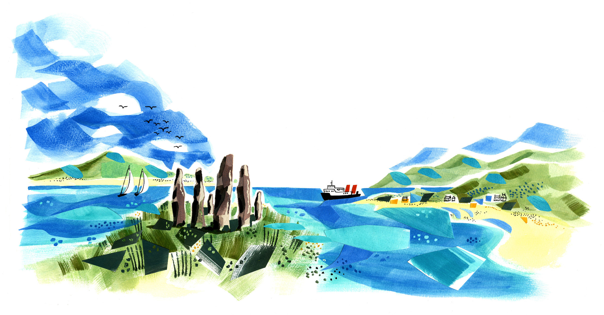
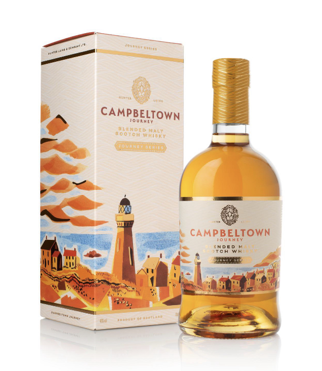
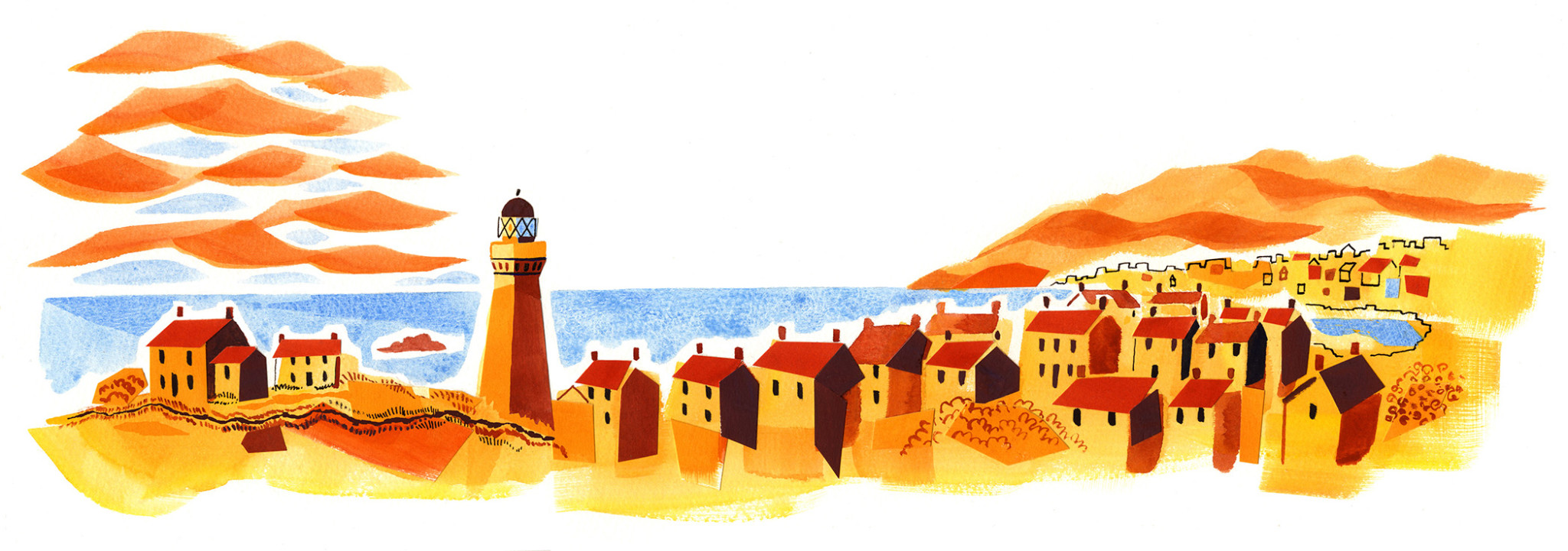
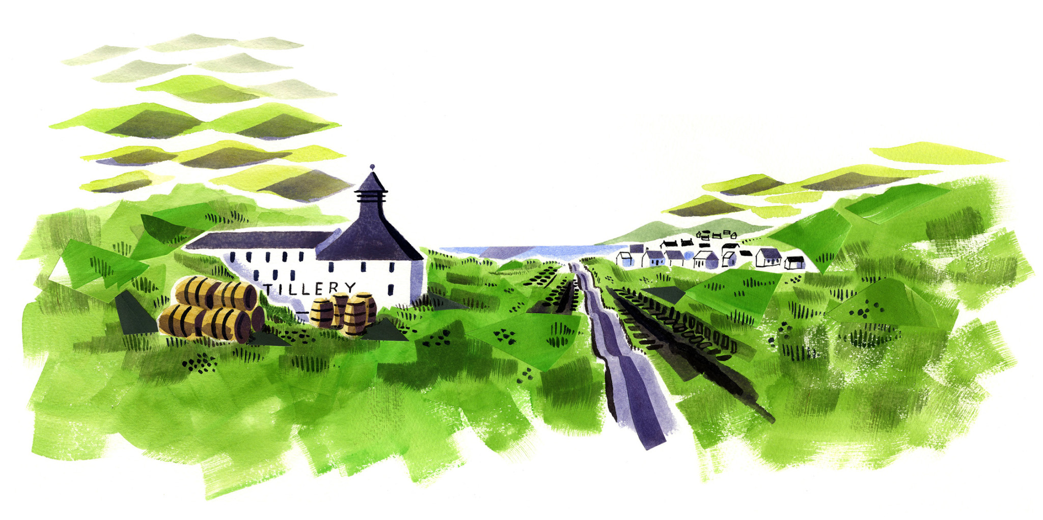
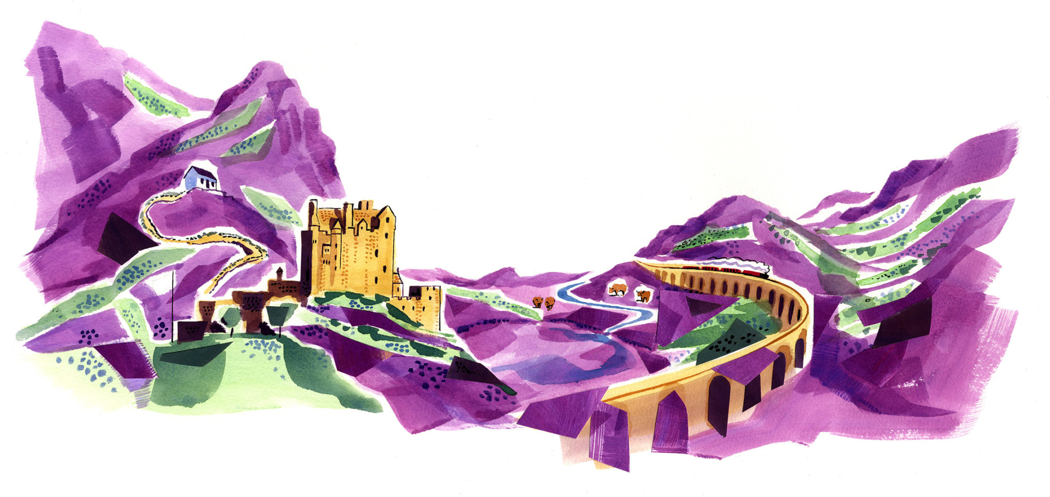
Sarah McMenemy has illustrated a set of four labels for the Hunter Laing series of Scotch Malt Whiskies, each one based on iconic locations across Scotland; Calpbeltown, Islay, The Hebrides and The Highlands. Each illustration conveys the atmosphere of each location through distinct colour palettes.
“The designer wanted abstract images with focus on certain details, so I used broad brushstrokes with collage for the backgrounds with finer line work on the details, all created on paper, then tuned in Photoshop.” Commissioned by Edinburgh based design consultancy Contagious, the illustrations work harmoniously with the packaging’s features, as well as evoking the warmth and vibrancy of both the locations and the whiskey.
“It was an interesting job to work on as it was bringing a contemporary and colourful look to a sector of the market which is known for it’s use of more traditional, conservative branding. It was bringing my location work to a branding project, which was an enjoyable combination, and breaking the mould in terms of style and colour.”


2 September 2022
Read article

31 August 2016
Read article

24 March 2020
Read article