12 October 2021
Sarah McMenemy illustrates icons to promote The Naval Children's Charity.
Read article
4 January 2018
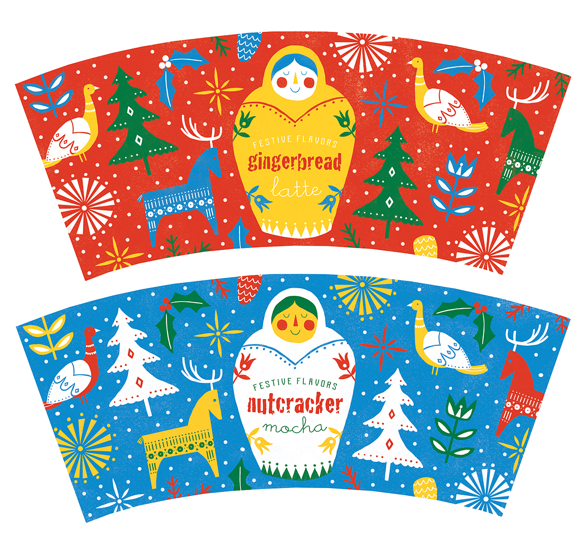
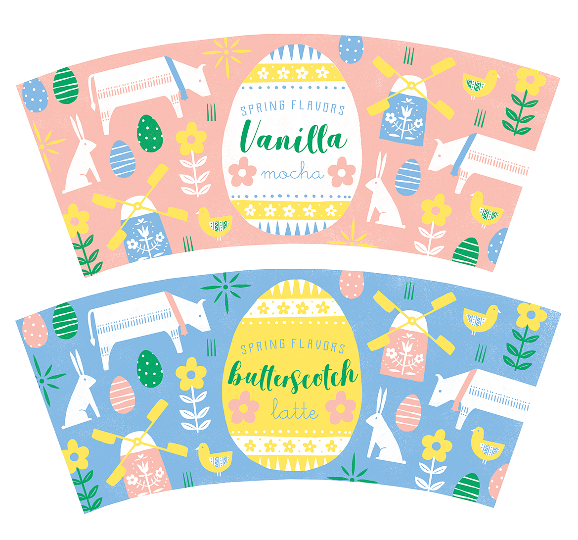
Posted in: Advertising, Packaging
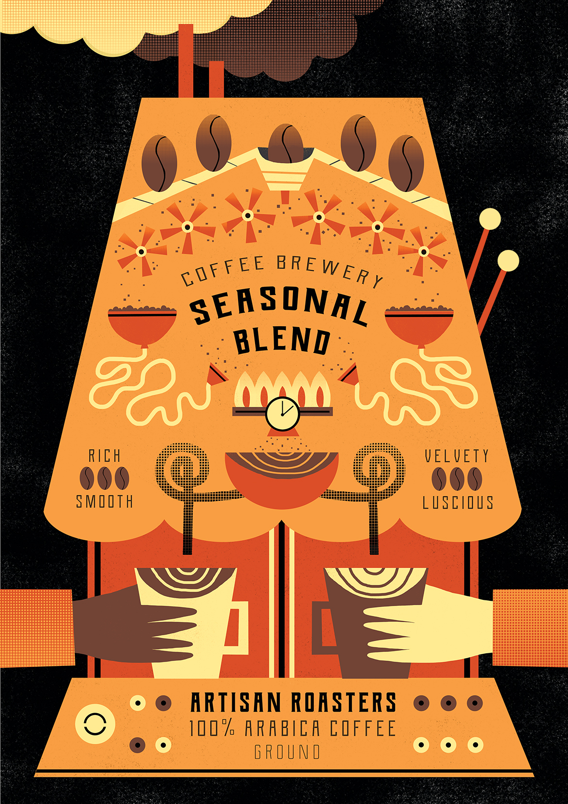
Rachael Saunders has recently been exploring the theme of coffee in a set of new and striking packaging designs. She set herself this challenge to help develop her graphic style, use of typography and the use of limited colour palettes. Bold shapes and patterns have always been a strong feature in Rachael’s work and it is clear to see that she has enjoyed working on these beautiful pieces.