
27 September 2018
Rachael Saunders designs a limited edition Picture Bag to celebrate the 20th Anniversary of Radley
Read article
27 September 2022
Posted in: Design, Illustration, Packaging
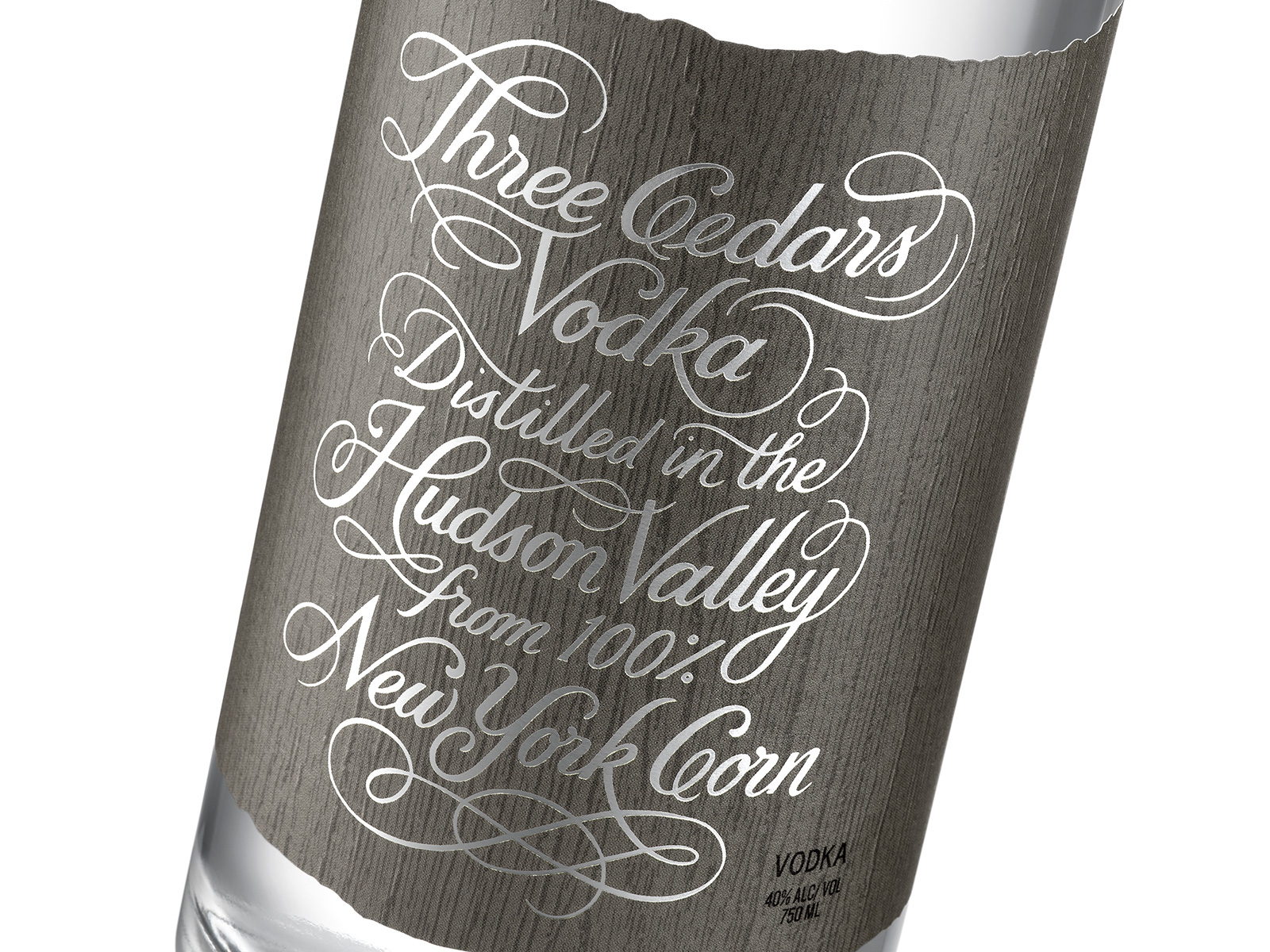
Kate Forrester has lent her hand-lettering expertise to Three Cedars Vodka, which design blog The Dieline has described as “gorgeous cursive script coupled with the rustic label edges creates a stunning contrast that’s unexpected yet grippingly captivates.” Couldn’t have said it better ourselves!
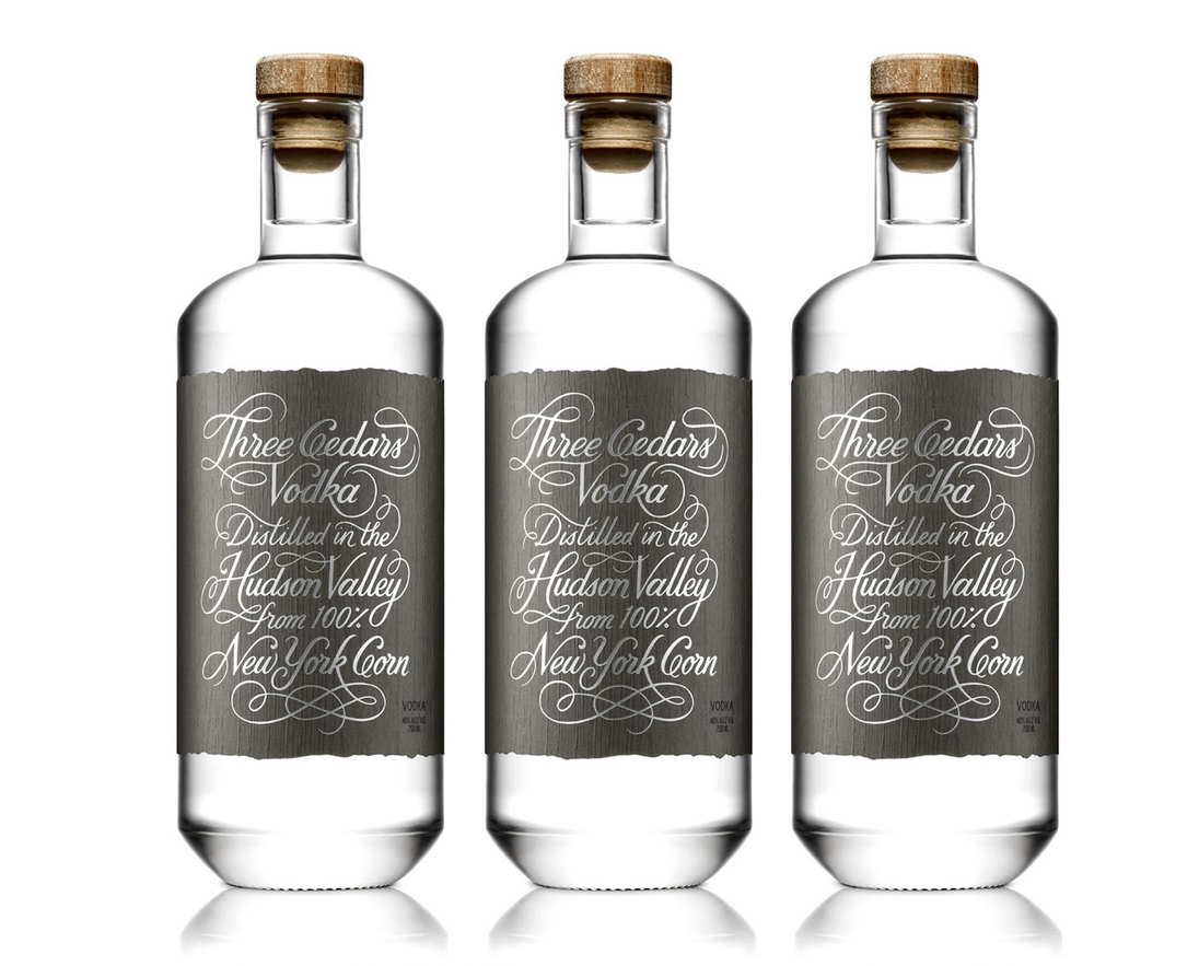
The design is simple, allowing the typography to become the main character, but utilizing an intricate script typeface creates a design that feels anything but minimalistic.
Chloe Gordon, The Dieline
The packaging was designed in collaboration with Pavement Design and “ is influenced by and pays homage to the Colonial history of the Hudson Valley, creating an uncomplicated and sleek look sure to attract today’s discerning craft spirits consumers.”

